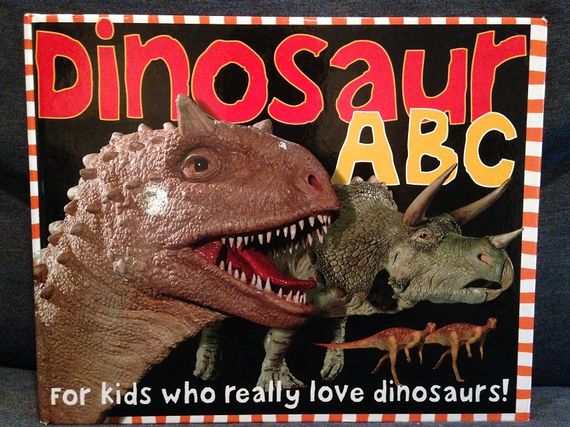
I’ve reviewed a few books now, and while I’ve liked some more than others, I have yet to post a negative review. I’ve felt for a while that I should seek one out to help establish a baseline for reviews on this blog, and to give readers an example of what to avoid. With that in mind, let’s take a look at Dinosaur ABC!
The book’s title is fairly self-descriptive: author Simon Mugford showcases a different dinosaur or other prehistoric animal for each letter of the alphabet. I approve of the basic concept of the book, especially as this provides an easy excuse to showcase more obscure animals the reader may not have heard of before.

Unfortunately, we don’t really get to learn all that much about them. Each entry only gets a small little blurb of text, which only ever provides fairly basic information which often glosses over contentious ideas about certain dinosaurs (such as the possibly sail-backed Ouranosaurus). In the end, I find very little to either commend or criticize in the text itself.

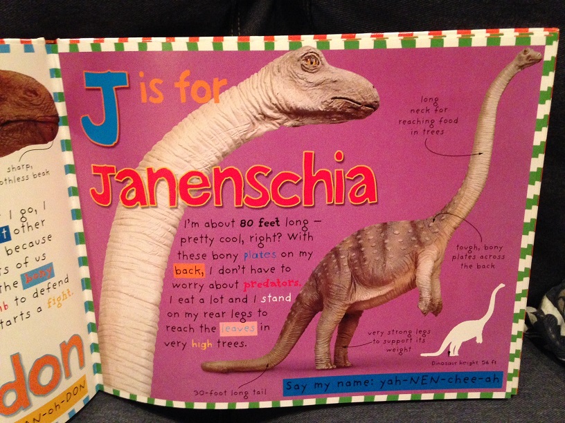
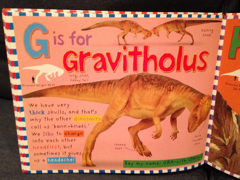
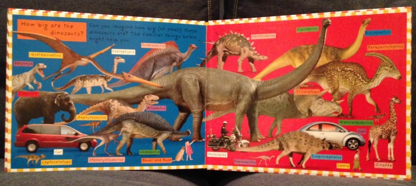
The book focuses far more on the visuals, and here it kinda tends to fall on its face. The book’s illustrations consist of photographs of models produced by Graham High of Centaur Studios, with the page layout arranged by graphic designer Jo Riggs. Though some models look better than others, and I even find a few somewhat good-looking, the majority of the models used simply look ugly to me. I feel somewhat conflicted in that opinion, since at least these aren’t stock photo CGI abominations, but I can’t get around the fact that many of them just look off.

I say this from an artistic standpoint as well as with regards to accuracy, though those few models that adhere more closely to their probable life appearance coincidentally always seem to look much less off-putting. Most of the animals end up looking lumpy and misshapen, whether or not one has a thorough knowledge of their real-life anatomy. Each creature also comes with a little “scale bar” off to the side, where their silhouette measures up to that of a human. Leafing through the whole book, I’m not sure that a single one of these scale bars is at all accurate. For some of the more egregiously out-of-scale comparisons (such as Gravitholus), I have to wonder whether the production team mistook length for height, and scaled the creatures accordingly.

Beyond the dinosaurs themselves, I find even the basic page layout obnoxious, and even somewhat exhausting. The page layout looks messy and cluttered, tending to distract the reader’s eye. The overall layout combined with the odd highlighting end up making it more of a chore than it should be to read the otherwise basic text splashed all over the page. One might think said highlights would help the different ideas stand out, but ultimately they only contribute to the visual noise. I can understand how such a layout might grab a child’s attention at first glance, but I can’t imagine it sustaining their interest long-term.

I suppose I’ve made my opinion of the book clear already, but maybe I’m out of touch. What might the kids think? Well, while my older child would occasionally pick up this book to read on his own, he only seemed to be interested in the ABC’s themselves. He would sing the song to himself while pointing at the letters, but then quickly turned the page to move on to the next. He rarely seemed interested in looking at the pictures, against his normal inclination. He has since seemed to have lost interest in this book entirely. I definitely recommend against this book. There are multiple, far better dinosaur ABC books out there, and I’d hate to see any of those books miss out on a potential customer who bought this instead. Save your money! I will introduce you to some of these better volumes soon enough. (Update: if you want to skip straight to the best of the best, check out Mammoth is Mopey, by David & Jennie Orr!)

(P.S. I suppose I should mention this is the 2004 edition of the book. Newer editions appear to have text that is rather more readable, though they still appear to use the same dinosaur models.)


Wow, gotta disagree. When I was a kid I LOVED this book. Literally would read it every night. I found every bit of it fascinating and exciting. Years later I still remember every fact and every dinosaur from this book. And I am now considering a career in palaeontology!
LikeLike